Agency
Location
Industry
How do you guide users through complex content on a website?
Challenge
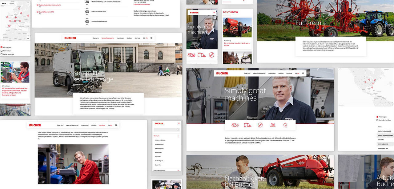
The aim was to make the user interface clear and reduced so that the knowledge can be conveyed more easily and quickly.
The paths to information should be designed to be user-friendly and previously known hurdles should be broken.
At the same time, the website should undergo a rebranding.
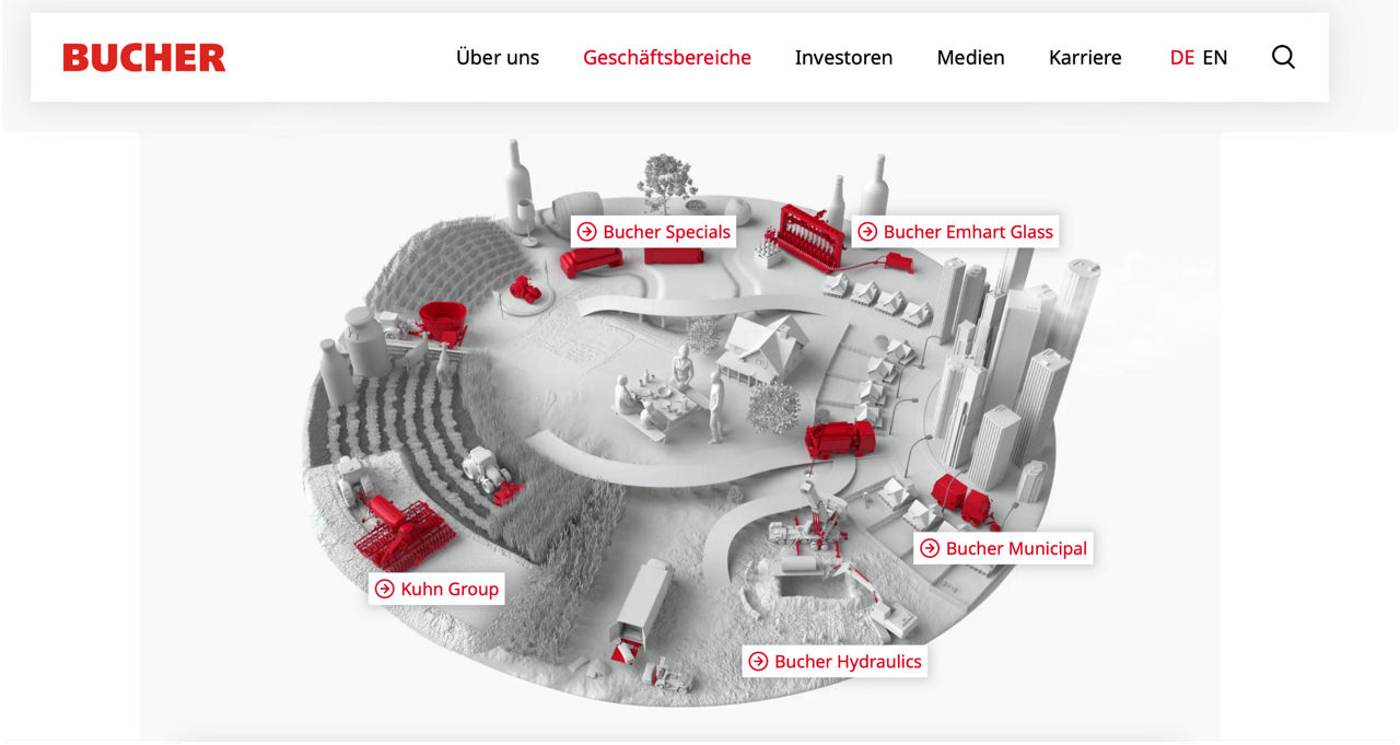
„The clean font, the lightness of the icons, the spacious layout and the animation of the Bucher world, make it easy for the user to navigate through the website and get a better understanding of the technical products.“
Creative Lead
Plan.Net
A clear, simple structure with self-explaining icons.
Solution
The user interface has been simplified and designed intelligently, which has led to lower bounce rates and more pages/sessions.
The website was newly used at events and trade fairs and was used as a tool across departments.
As a result, the path to the website via organic search has also been optimized and continues to be continuously processed with SEO.
Key Takeaways
#1
GAMIFICATION
Gameficiation is already a way how to present information, not always requires interaction.
#2
VISUALISATION
Especially in B2B with complexe products, the visualisation is key to ease user experience.
#3
COMBINATION
Good User experience can only be achieved when function und design work together in every detail.
„It’s always a challenge to drive the success of the website together with the client, might it be in regard to design development, SEO or optimizing the analytics basement.“
Client Lead
Plan.Net


1?qlt=85&ts=1769623086720&dpr=off)


