




Key Takeaways
#1
Build the identity from a symbol people already know.
#2
A typeface puts the cause into every single word.
#3
Keep it usable for teams without designers.
Location
Germany
Industry
Health & Public Sector
Services
Awards
- Best of the Best | Red Dot Award | 2026
- Gold | German Design Award - Typograhie | 2026
- Winner | German Design Award - Branding | 2026
Overview
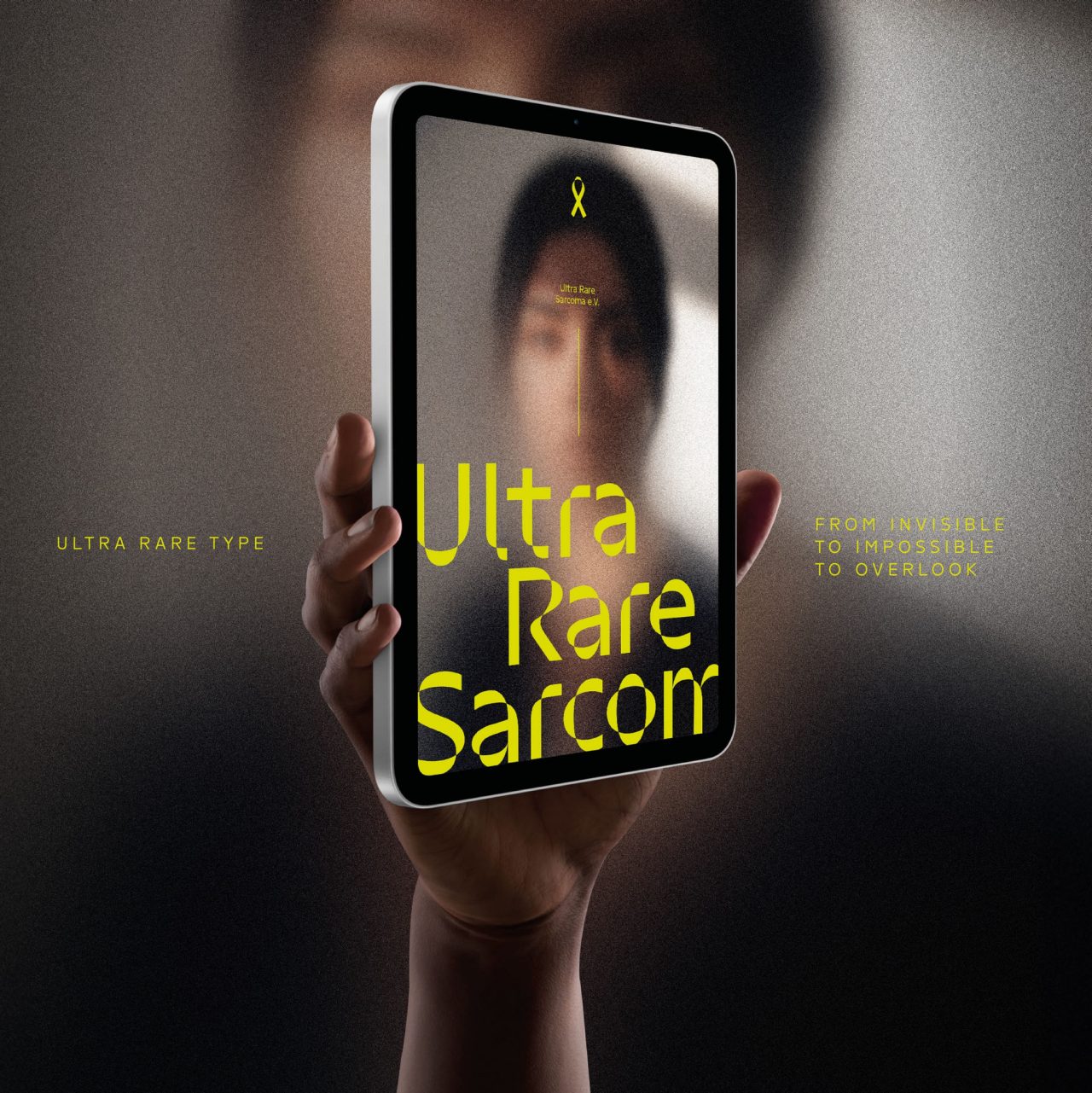
Ultra-rare sarcomas affect fewer than one in a million people and are largely invisible. For Ultra Rare Sarcoma e.V., we made the yellow awareness ribbon the foundation of the brand identity: a custom typeface derived from its geometry, fluorescent yellow and blurred portraits that symbolize patient invisibility. Across all touchpoints, it turns an overlooked disease into an unmissable cause.
Challenge
Making the Nearly Invisible Visible.
Fewer than one new diagnosis per million people each year: that is how rare ultra-rare sarcomas are. Their rarity leaves patients largely invisible to society, research and the pharmaceutical industry.
Ultra Rare Sarcoma e.V. was founded to change that. A symbol already existed: the yellow ribbon, a sign of awareness and solidarity. But it was often overlooked, just like the patients it represents.
The brief to Serviceplan was twofold: create visibility for a disease few people know about, and develop a distinctive identity that a small non-profit can apply consistently without extensive design resources. The identity also had to raise awareness without sensationalism and preserve the medical credibility of the subject.
The goal: increase visibility, strengthen recognition and unite patients, supporters and advocates around a common cause.
How do you turn an overlooked symbol into a voice no one can ignore?
Solution
Turning the Ribbon into a Living Identity.
Instead of designing another logo, Serviceplan made sarcoma’s strongest symbol, the yellow awareness ribbon, the foundation of the entire visual identity.
We turned the ribbon’s overlapping and twisted paths into a complete typeface. Every letter, numeral and punctuation mark is generated from a single geometric module derived from the ribbon, so every headline, post and message communicates awareness. Fluorescent yellow and blurred portraits complete the system, symbolizing patient invisibility.
The project combined Brand Design, Corporate Identity, Typography Design and Communication Design. Most of the effort went into balancing concept and usability: each character had to stay traceable to the ribbon and still meet professional legibility standards.
Serviceplan delivered a fully functional OpenType font family, now used across social media, the website, print materials, merchandise and internal communications, without specialist design skills.
Because icon and alphabet form one system, the ribbon is no longer an isolated symbol. It appears in every word the association writes, increasing recognition, strengthening community and supporting fundraising.
Awards

Red Dot Award
Best of the Best
2026

German Design Award
Gold (Typographie)
2026

German Design Award
Winner (Branding)
2026
Offered services
Let´s Talk
Do you require assistance with your project?
We would be pleased to advise you without obligation.
“Visibility is essential for attention, research and support. We rely on many people, partners and initiatives, so we needed an identity that works regardless of medium, format or design expertise. The new typography makes our communications instantly recognizable.”
Bastian Schwarz
Chairman & Sarcoma Patient
Ultra Rare Sarcoma e. V.

Further Cases from Serviceplan




About Serviceplan
Serviceplan is Europe’s largest independent creative agency and the founding brand of the Serviceplan Group. Founded in Munich in 1970, Serviceplan is now firmly established internationally through the House of Communication model and works in an integrated manner across media, data, technology, and experience disciplines.
The agency stands for ÜberCreativity - an interdisciplinary approach that combines strategy, creation, and technology to position brands as culturally relevant players. Serviceplan delivers integrated communication solutions across all channels, from brand and campaign development to experience and content systems.
Serviceplan’s creative prowess is internationally recognized: The agency consistently ranks among the most successful independent agencies at the Cannes Lions, ADC, D&AD, and other international creative rankings, and has been named Independent Agency of the Year on multiple occasions.

FAQ
Ultra Rare Type is the brand identity Serviceplan developed for Ultra Rare Sarcoma e.V., an association for people with very rare sarcomas. At its core is a custom typeface whose characters are derived from the shape of the yellow awareness ribbon, making the disease more visible.
Serviceplan derived a single geometric module from the twists and overlaps of the yellow ribbon. Every letter, numeral and punctuation mark of an OpenType font family is built from it, so Ultra Rare Sarcoma e.V. can use it on social media, website, print and merchandise without design expertise.
The key takeaways: the identity builds on a symbol people already know, carries the cause into every word through the custom typeface, and remains simple enough for teams without designers to use. The work won the Red Dot Award “Best of the Best,” Gold in Typography and a Winner award in Branding.